General Assembly:
Cog Design System
Overview
Led a team of multidisciplinary designers and engineers through an end-to-end development of a new Design System for General Assembly.
Filed Under
Role(s)
Principal Designer, Engineer
Live Site
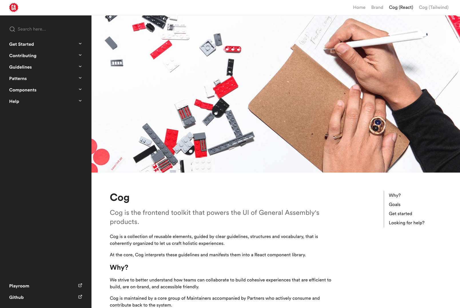
The Cog Documentation Portal
Overview
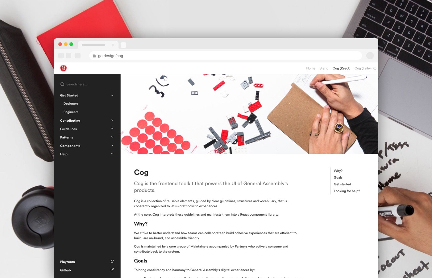
Cog is the frontend toolkit that powers the UI of General Assembly's products. Cog is a collection of reusable elements, guided by clear guidelines, structures and vocabulary, that is coherently organized to let us craft holistic experiences. At the core, Cog interprets these guidelines and manifests them into ready-to-go interface elements available in code (React/Typescript), and as Sketch symbols.
breaking down our existing styles into a simplified system, Cog
mapping the system to our existing landscape
The Mission
Lead a team of multidisciplinary designers and engineers through an end-to-end development of a new Design System for General Assembly. One which addresses the following goals to bring consistency and harmony to GA's digital experiences.
Goals
- Designing for experiences that work together, work the same each time, and work for the customers we serve.
- Building a logical and well-documented design language that promotes reusability.
- Promoting collaboration and standards of implementation between Designers and Engineers.
- Enabling speedy review and bootstrapping of new projects, features, and prototypes.
- Achieving the appropriate balance of constraint and flexibility.
- Allowing us to focus on concepts, experiences, and user flows, rather than unnecessarily granular design choices.
- Adapt and utilize well supported open-source efforts whenever considering adding new enhancements.
- Creating a repeatable QA process showing all states of all components.
Establishing a Governance Model
We decided that, a decentralized federated model would work best for maintaining and collaborating to Cog across multiple Product teams. This means there is a core group of Maintainers supported by cross-team Partners and Users.
All three outlooks are critical to the success of Cog, which is why it’s so important to have a healthy relationship that involves frequent communication and collaboration.
Maintainers, Partners, and Users are responsible for steering the future of the system making sure it addresses the needs of the end-user and the organization.
| Role | Description |
|---|---|
| Maintainers | Maintainers are members of Cog who are responsible for leadership, strategic direction, maintenance and core contributions. Maintainers provide a birds-eye perspective of the entire system. |
| Partners | Partners are members of Cog who contribute in a material way, with documentation, code, or design. Partners typically engage in technical steering and are typically power Users of the system. |
| Users | Users may use Cog to any capacity and may/may not directly contribute to it. They are part of the teams across the organization who use the system and employ it to specific applications. Along with Partners, they provide an on-the-ground perspective of the system. |
The Audit
Once we figured out how to steer the ship, an audit of our existing ecosystem started. I go into more detail about this audit in a separate post I wrote, from the lens of Accessibility First.
Audit of existing experiences
Documentation
Cog is more than just a component library. Documentation was an important part of the first phase of work. Shortly after we distilled our audit into a first draft of the system, documentation began. Previous systems at GA lacked documentation with depth and thus didn't age very well, and were often not used as intended and discarded.
I spent roughly 2 months designing and laying the foundation for a documentation portal that covers Brand Guidelines, Color, Iconography, Typography, Patterns, Components, Help/Support, Getting Started guides and a Live Code playground.
ga.design cog documentation homepage
Every component in Cog has a corresponding page dedicated to covering:
- Usage guidelines, when to use and not to use it.
- Alternatives, similar components that might suit your need better.
- Live code examples.
- Property definitions.
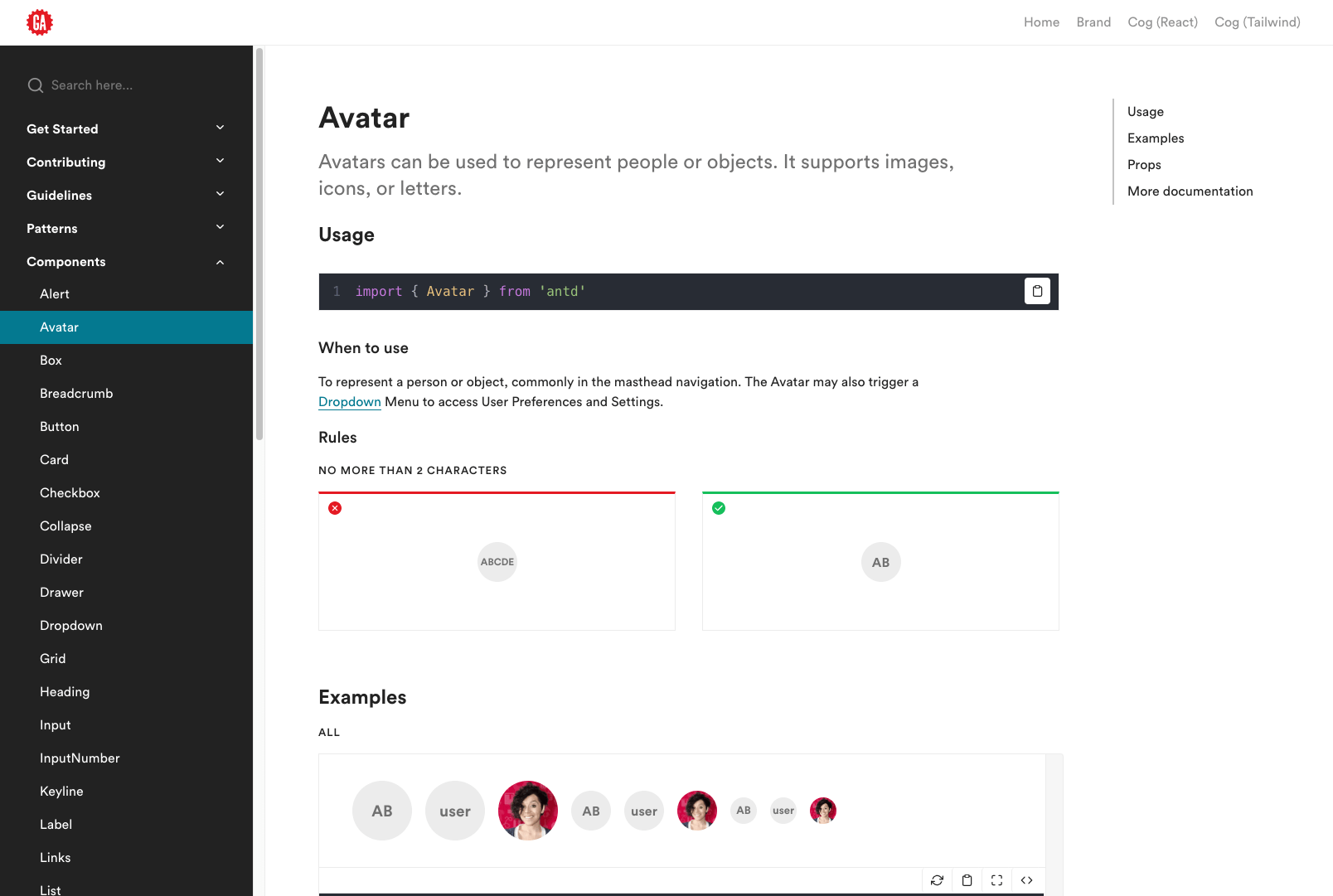
A Cog Component Page
The documentation portal is built of components from the system itself. It's powered by simple Markdown(MDX) files and is now hosted at ga.design .
Refinement
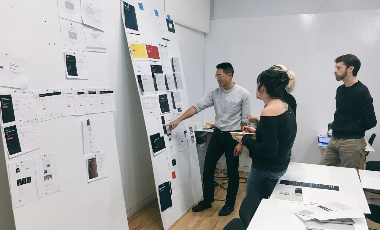
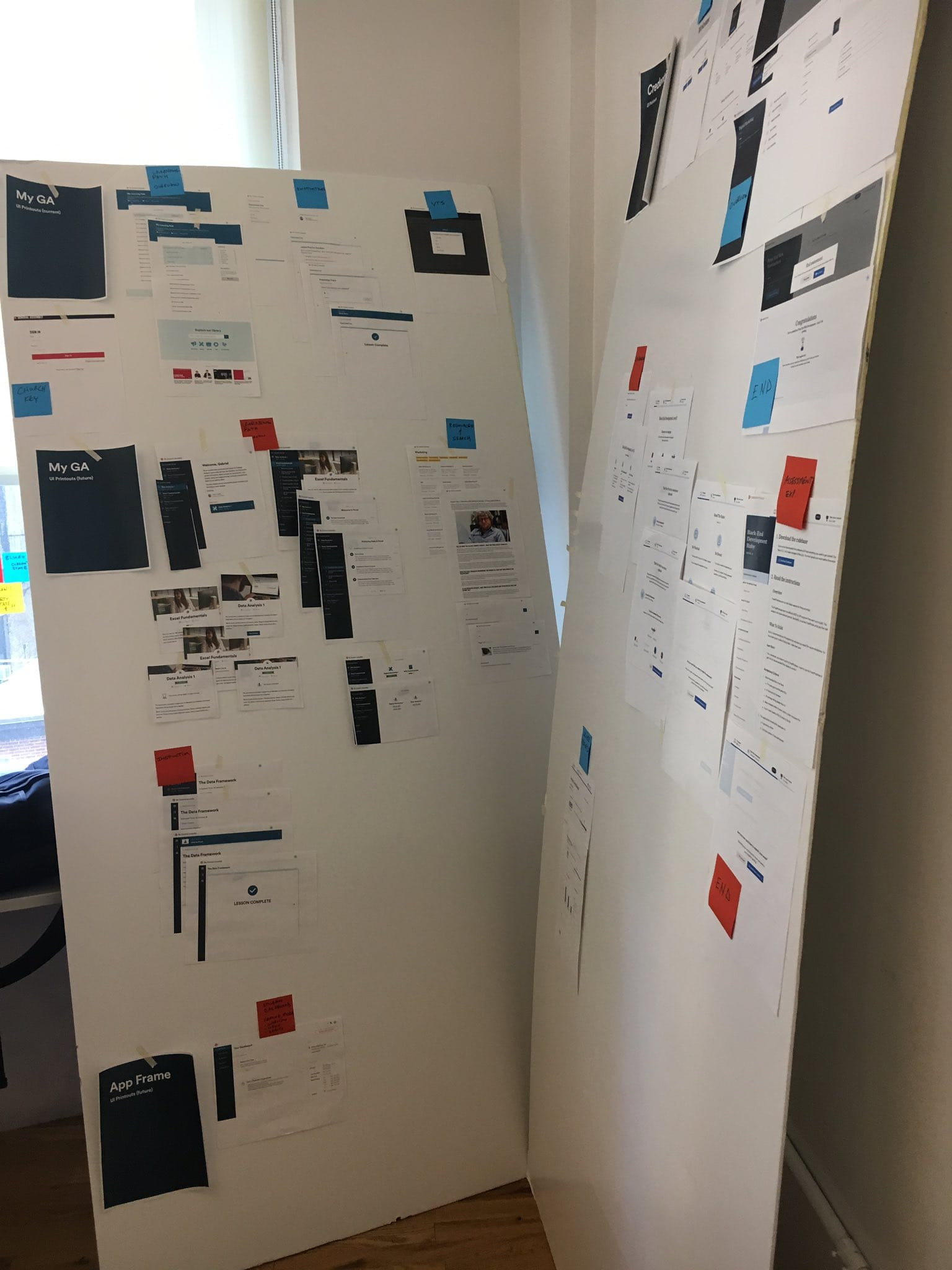
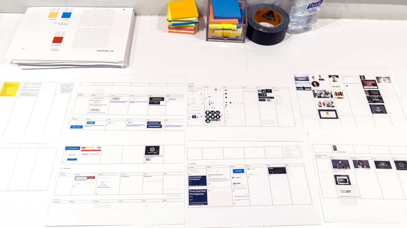
Of course the first pass could always use some adjustment. We spent a good amount of time testing out different treatments of typography, color pairings, and example interfaces (based on our actual products) in order to make sure things look and 'feel' right.

Group critique typography board
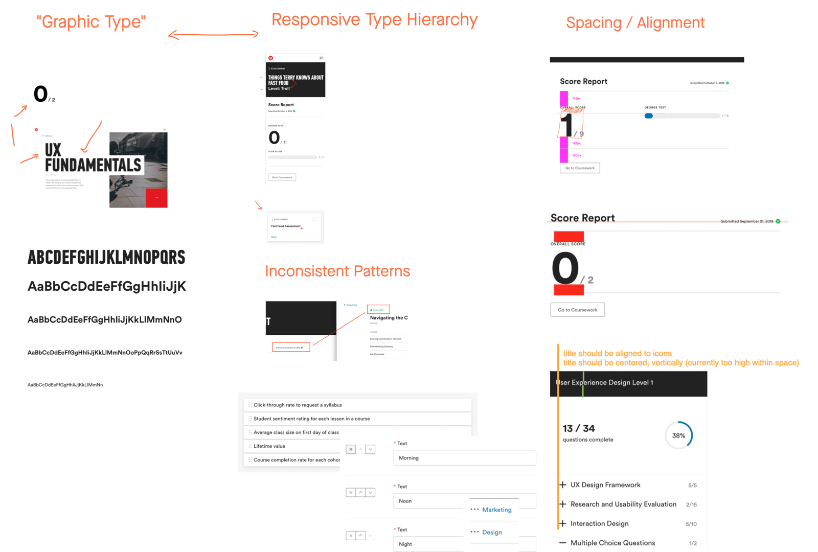
refinement pass across our UIs
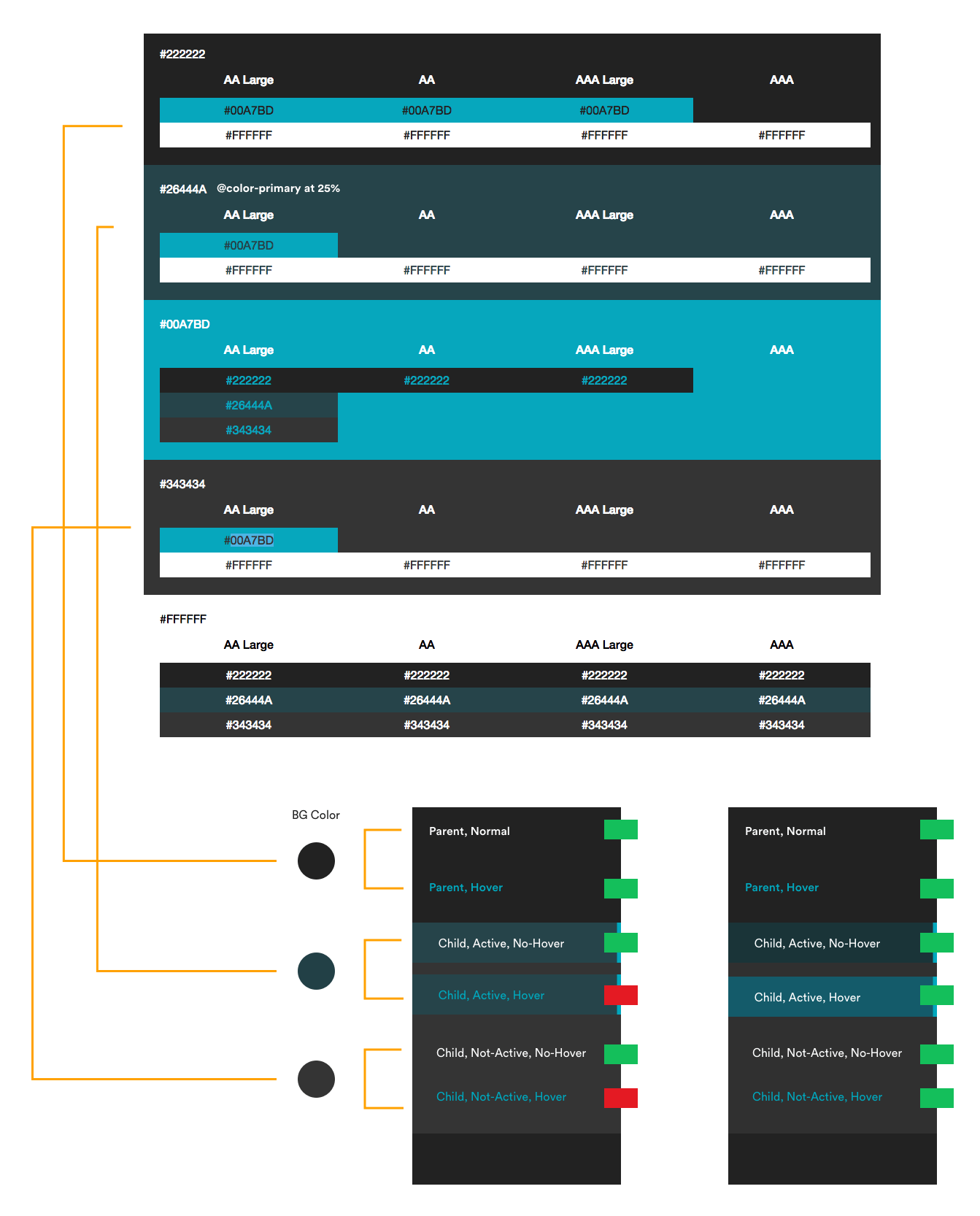
refinement pass on WCAG AA color pairings for sidebar component
Version Control
Version control is a key tool in a Developer’s workflow, but for Designers?
We had the need to all contribute to one source-of-truth, and maintain accountability. I did research on different approaches here and at the time Abstract was the best fit. Abstract is essentially a way to manage large scale projects using Gitflow for Designers.
We wrote a guest post a few years back detailing more of our workflow with Abstract .
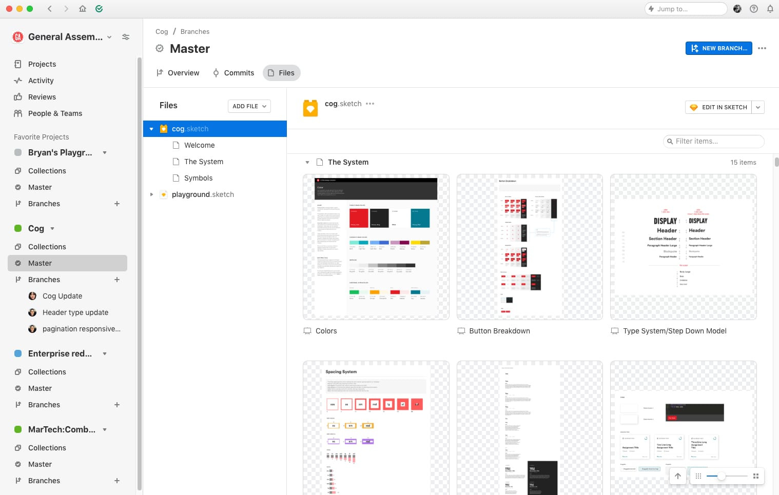
The Cog Sketch library versioned in Abstract
The Symbols
The Cog Sketch symbol library is comprised of all low-level components, and a few common compositional ones that make up our product experiences. The Library can be linked to any project to quickly insert symbols. These patterns and components provide a unified language and consistent look and feel when designing within the GA ecosystem.
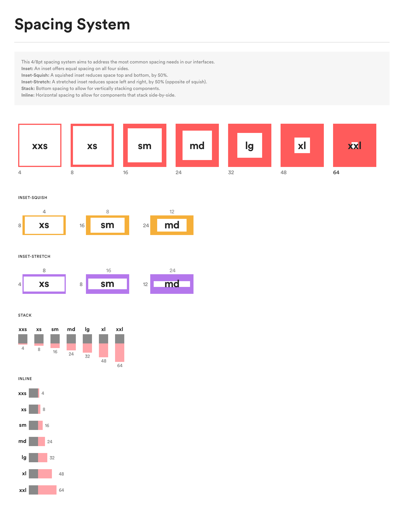
Spacing System
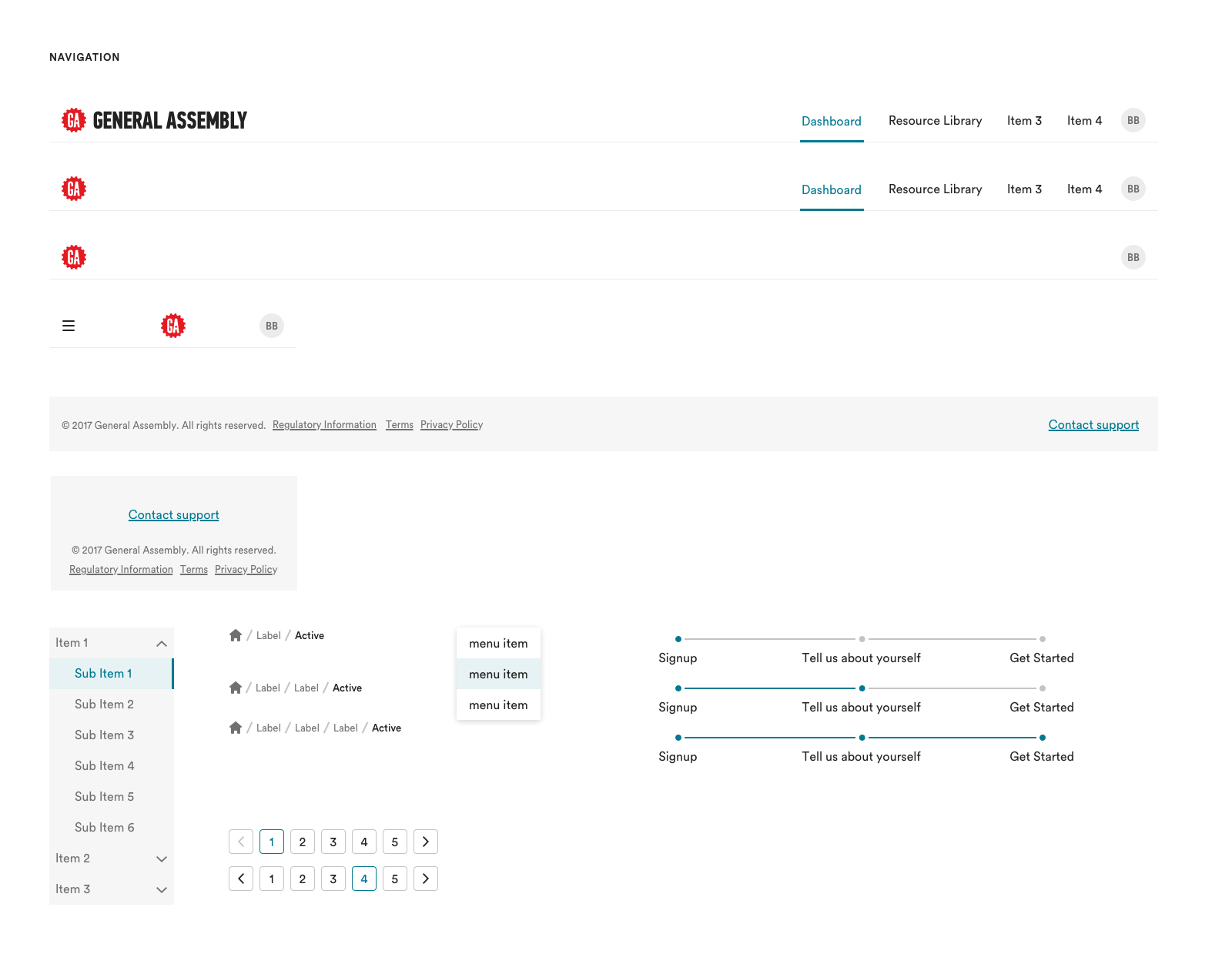
Navigation Elements
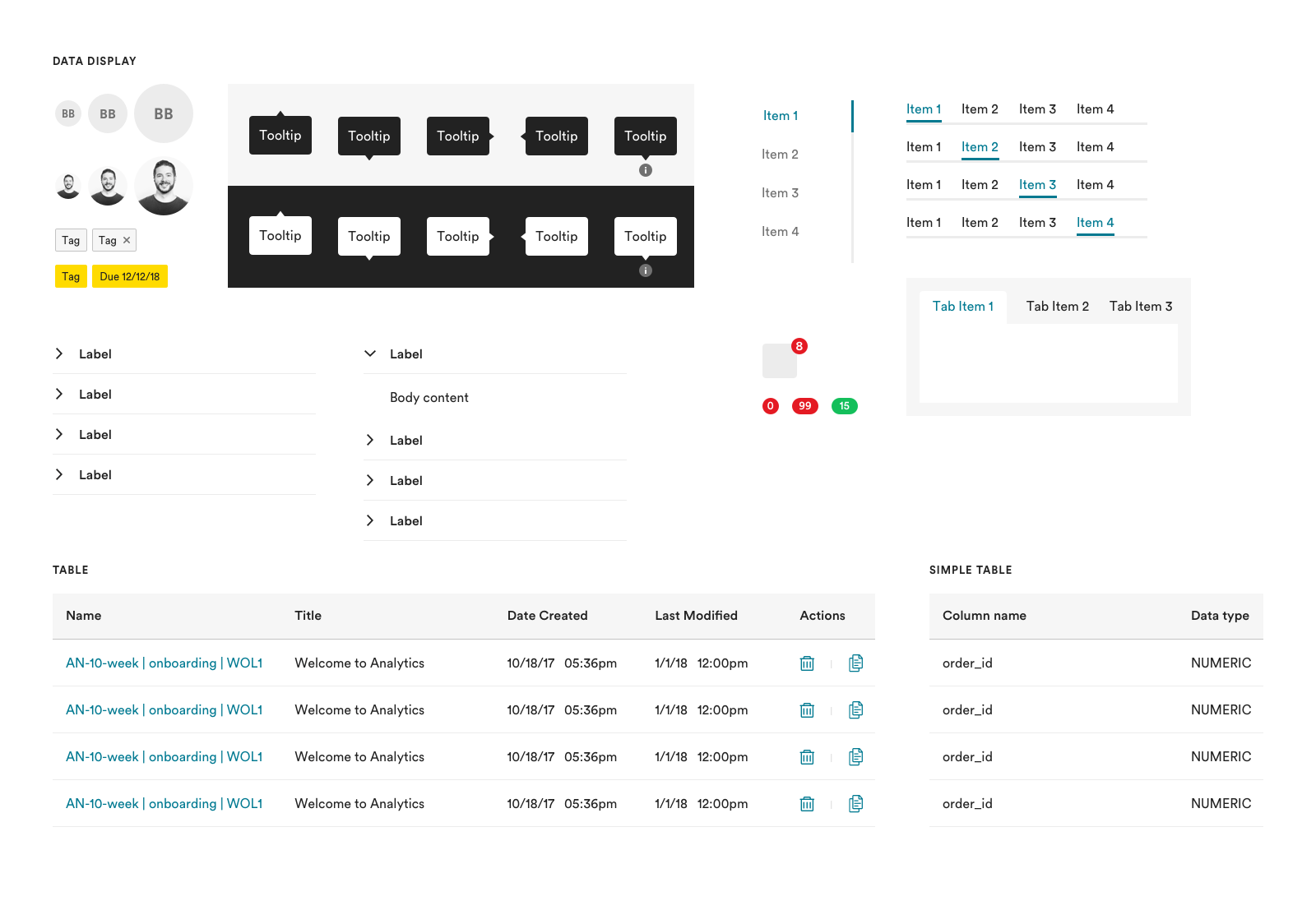
Data pt1 Elements
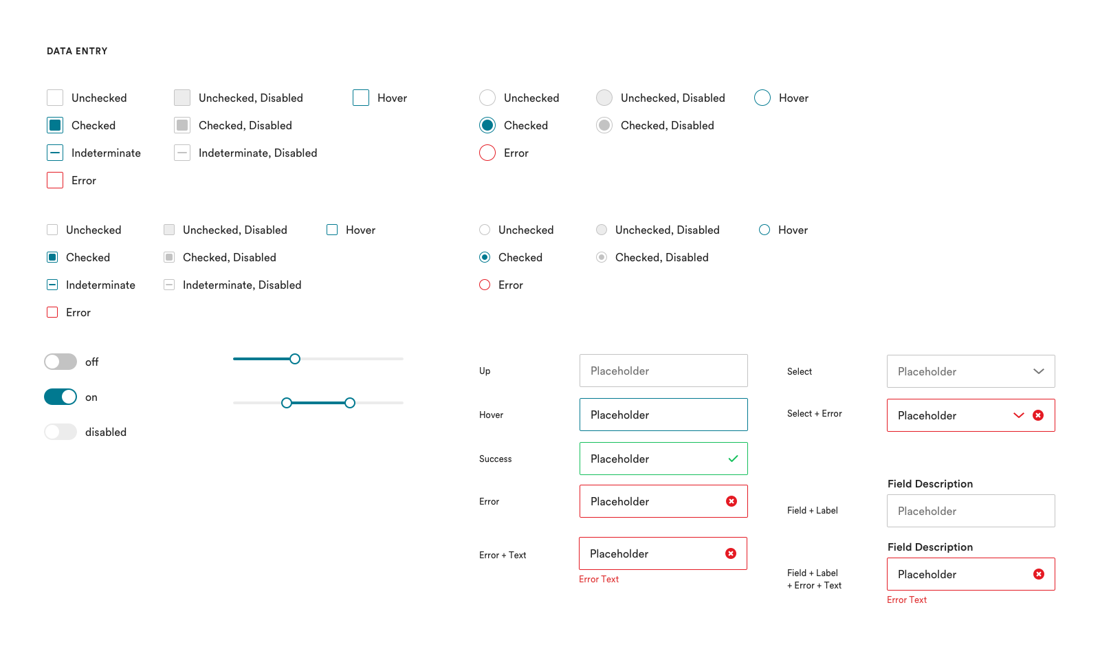
Data pt2 Elements
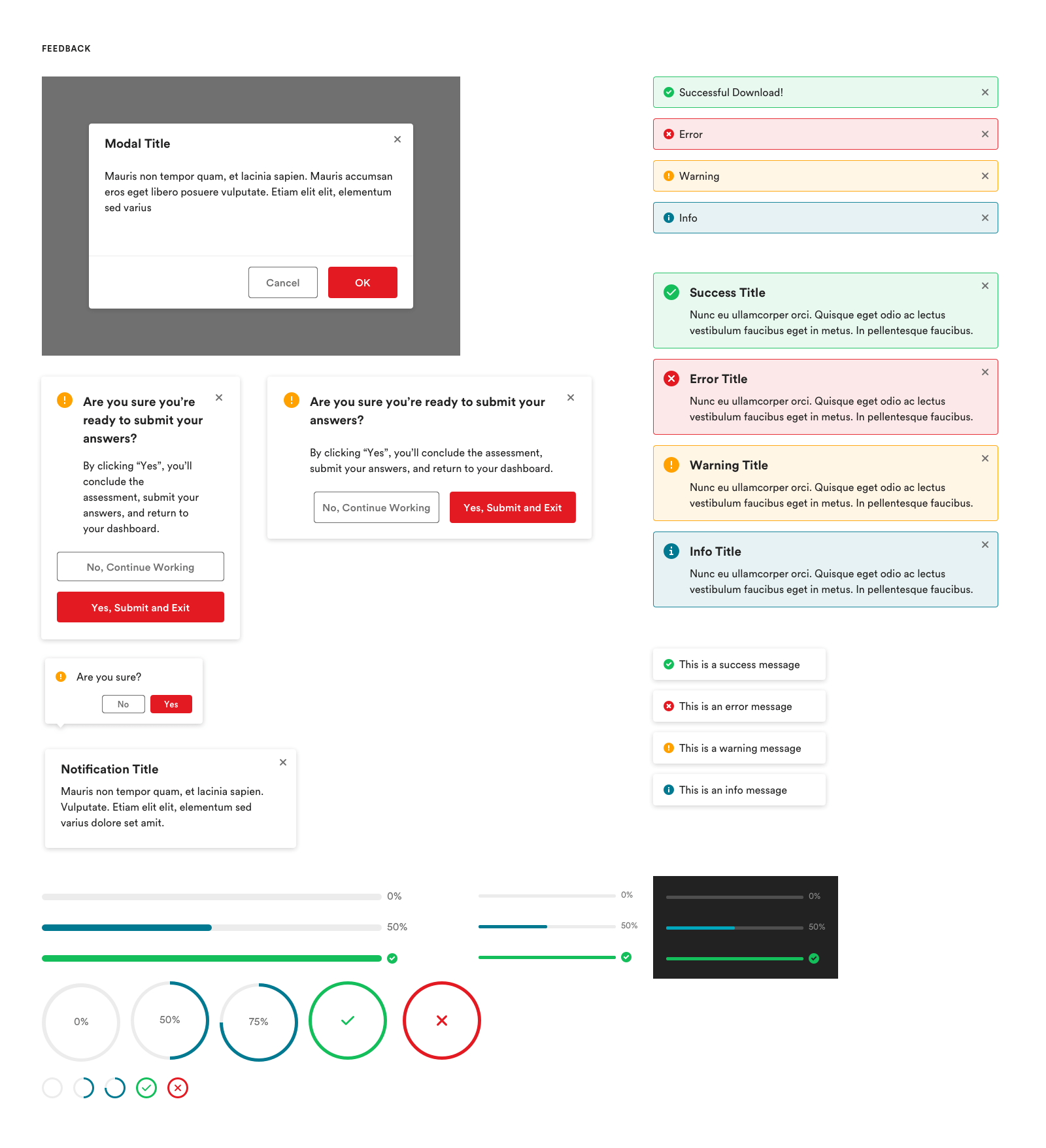
Feedback Elements
Nav Elements
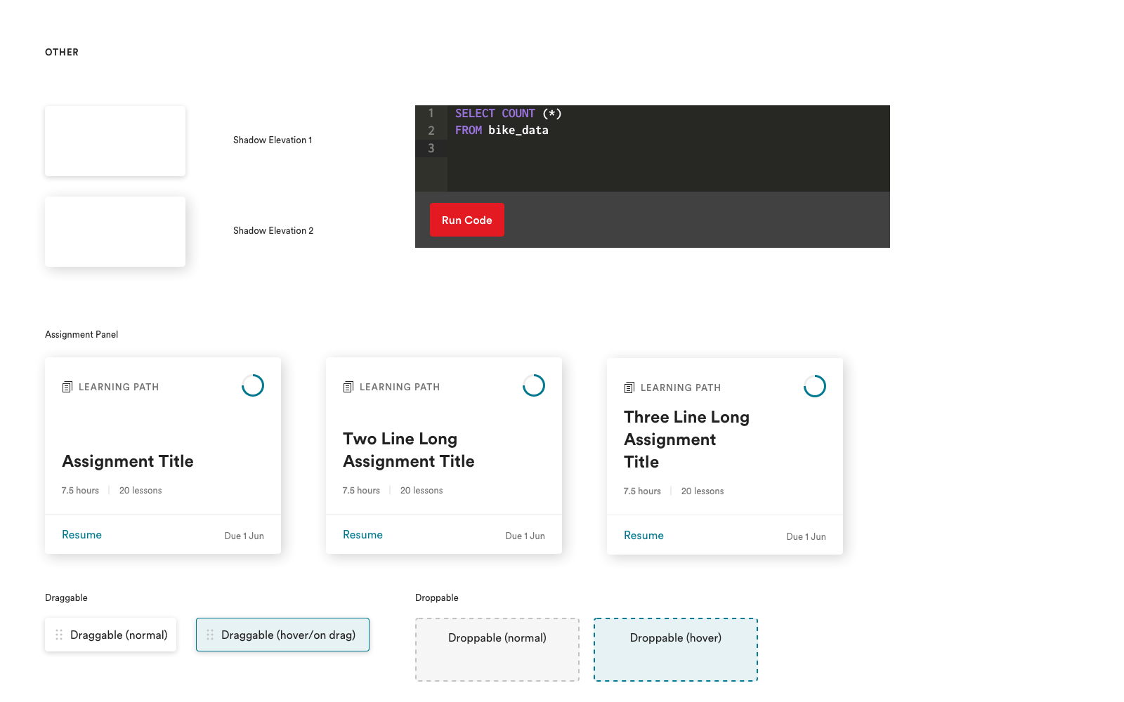
Misc Elements
Conclusion
The React version of Cog is now used in our custom Learning Platform and LMS. It serves experiences for both B2B and B2C customers alike. Cog has allowed a relatively small team of engineers and designers to build critical differentiating software for GA. Since its release, Cog sits at v4.* and has seen many improvements and contributions from the team and myself along the way.
Edit 2019:
We are exploring using FramerX to help alleviate the symbol library from falling out of sync with our codebase.
Edit 2020:
We recently expanded Cog to allow applications not written in React (most of our web properties) to utilize the same design styles and components in a much slimmer package. This flavor of Cog is powered by Tailwind, a css utility first approach.