General Assembly:
Browse Experience
Overview
Build an intuitive experience for discovering products via the GA website.
Role(s)
UX Engineer
Live Site
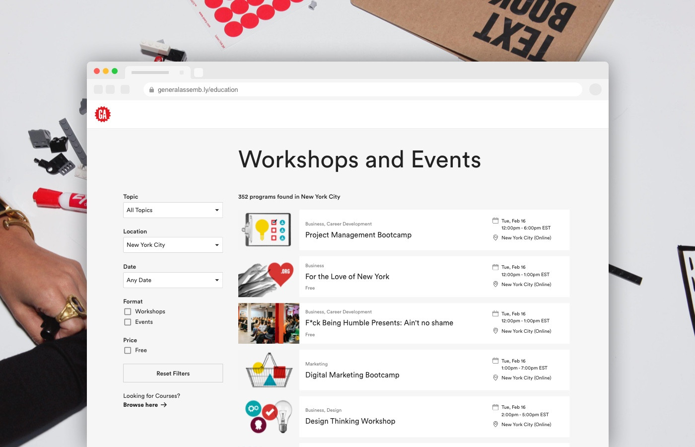
The Event and Workshop Browsing Experience
Overview
The General Assembly website has a large e-commerce component and is essentially a storefront for all classes, workshops, and events.
Usability testing at the time made it clear that the discoverability capabilities on the site were lacking, not intuitive, nor centralized.
Our goal was to help customers understand the breadth of our product offerings via a centralized experience for navigating the breadth and depth of products. The hypothesis was that accomplishing this goal would reduce customer friction and streamline the critical business path from interest to lead to paying customer.
How might a (prospective customer) learn about the products GA offers, to find what they may be interested in?
The Mission
- Talk with our customers.
- User test low-fi prototypes.
- Setup an A/B testing ground for more interactive prototypes, (Optimizely ).
- Utilize Cog for the build, GA's React based design system.
- Accommodate the outcome for the shift in business to entirely remote (COVID-19).
Baseline User Research
3 rounds of scenario based user studies were conducted in order to understand the landscape from a variety of customer perspectives.
The Product Catalog
We sought to gain insights into how customers perceived and characterized the different product types GA offers; there are 4 distinct categories.
"You have to really know what you're looking for and what you want to do to be able to use this..."
"I wasn't sure how the two part-time classes differed from each other..."
Could not distinguish between individual products within a topic.
Were unable to successfully choose a program that fit a given scenario.
Were confused about the terminology currently used on the page.
A/B Testing
This was the first time GA was able to comprehensively test multiple critical parts of the website (simultaneously) using server-side a/b testing (with no clientside flicker)!
We setup a “launch plan” to ensure we can accurately track a meaningful status of our on-going experiments.
- Optimizely FullStack (overall conversion)
- Downstream metrics (revenue)
- On-Page performance (page views)
- On-Page interaction (user activity)
- Server/Client internals (new relic/honeybadger)
The Build
One of my biggest responsibilities was to work closely with the UX Design and Writing team to translate insights from the usability testing into a prototype (and later a working production build).
The Faceted Navigation Event and Workshop Browse Page
The application itself is comprised of a Rails backend which fetches and caches the program catalog. My main focus was on the frontend where I stubbed out the UI and built integrations to consume and filter the catalog based on user input.
I built the frontend using React and Typescript and the Design System I'd worked on extensively. I also added a unit testing suite to ensure that all filters and facets produced valid/expected results.
React made this project a breeze. There is one central state (context) that is rendered server-side and also asynchronously hydrated via user-actions (ie: changing a filter).
I added list virtualization which dramatically improved render and paint performance as the list would often want to display more than 500 elements which produced a rather dense DOM tree (adding pagination was also a possible improvement we discussed).
Post Launch Improvements
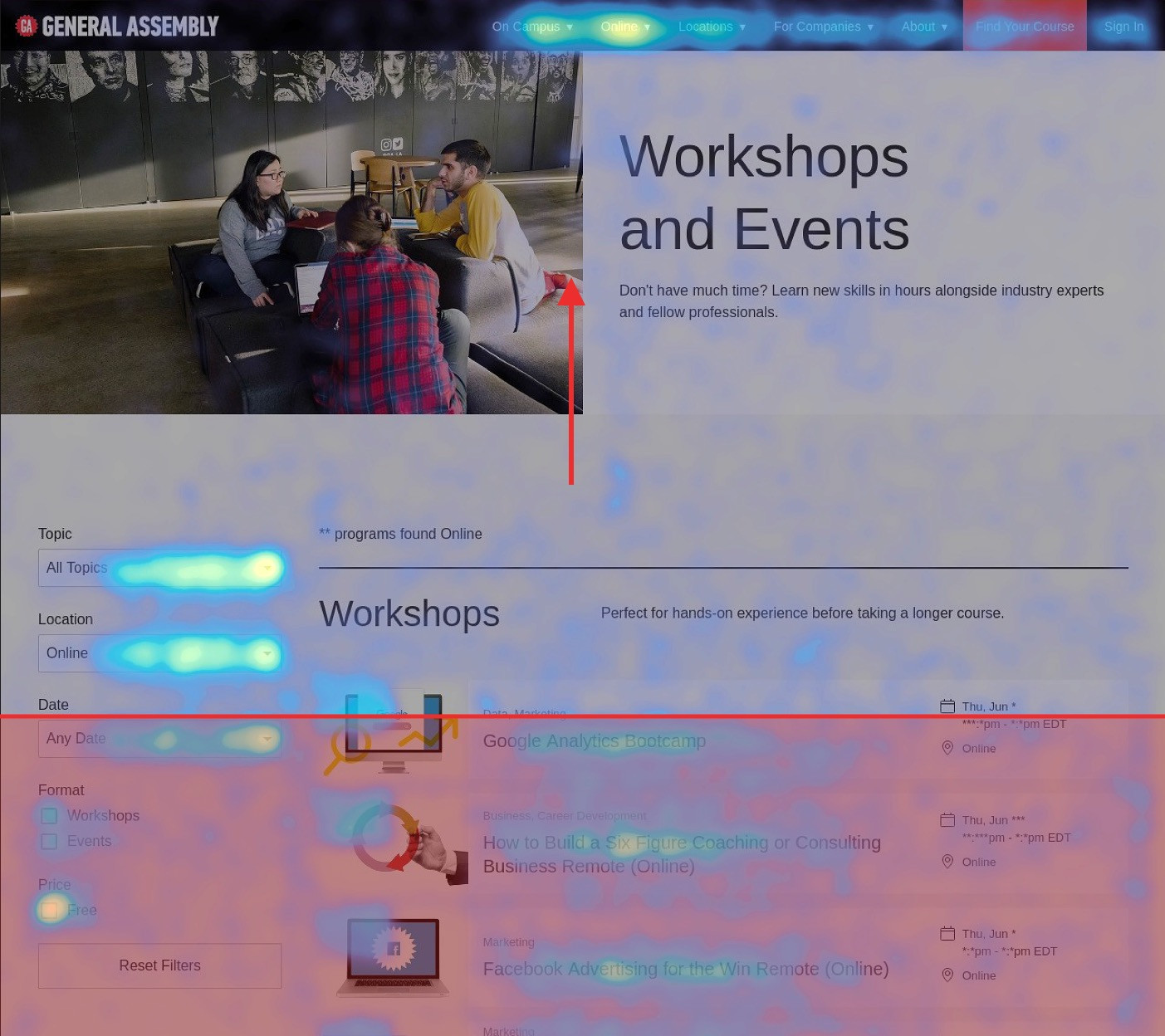
Post Launch Heatmap
Based on page and user activity we cut parts of the page that saw little activity to optimize focus and reduce page-weight. We also introduced other optimizations and tested them to gauge metric improvement. Here are some of the successful improvements:
- Improved server response times (v8 perf).
- Improved client-side rendering performance (critical css, compression, lazy-loading).
- Improve 1st page impression + average-fold visibility.
- Introduce list virtualization (scroll performance).
- Preloaded more products (to improve purchasing months out).
- Improve "free" indicator.
Conclusion
Overall, this project was a great combination of thorough user research, A/B testing, utilizing past efforts, and rapidly improving post-launch.
We meet our goals and then some. The outcome of this project improved our KPI conversion enough to cover the full team's cost for the remainder of the year. This would allow our team to continue refinements, and spend time working on other investments.
Edit: This case-study is a "work-in-progress", more detail regarding the design process incoming!
to full-time lead conversion
to part-time lead conversion
Lift to overall revenue, an impact of $600,000/m!